I really don’t like the design of the progress pride flag, and I couldn’t really put my finger on it until I saw this: https://nava.org/good-flag-bad-flag
For reference, here is the flag I’m referencing as “bad flag”:

And here is the original:

So, the original has too many colors, but it’s the colors of the rainbow. In order. It’s recognizable from really far away, and it’s dead simple to draw.
With the Intersex flag, that’s 14 colors. There are three shades of “purple”. The circle won’t be visible from far away. The chevrons are too thin to be very recognizable from far away.
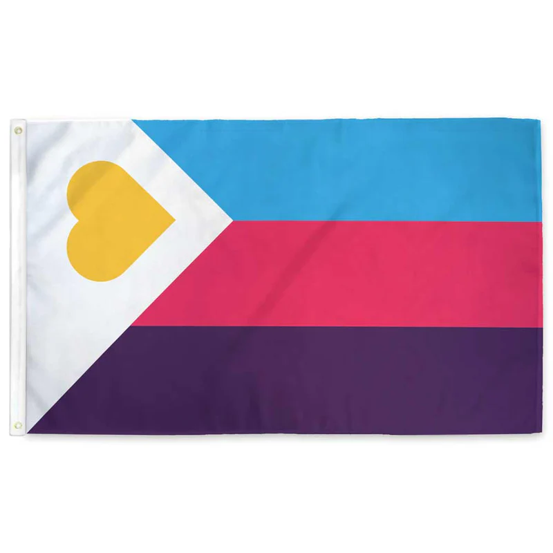
It’s not like there aren’t good pride flags. Like there are AMAZING ones:


Edit:
In case you don’t know what these are: https://flagsforgood.com/collections/pride-flags


What annoys me about takes like this is that it seems to be appealing to some sort of council of gays who are in charge of the flags. Nobody is. There’s no “official” flag. If you don’t like the progress flag or the intersex version of it then just don’t fly them or design your own that you do like. Nobody is stopping you. A ton of the pride flags in use today are just designed by random Tumblr users in the mid '10s. Which is fine, not hating on them, just making sure you know there is nothing stopping you from making one you like or flying the ones you prefer.