You must log in or register to comment.
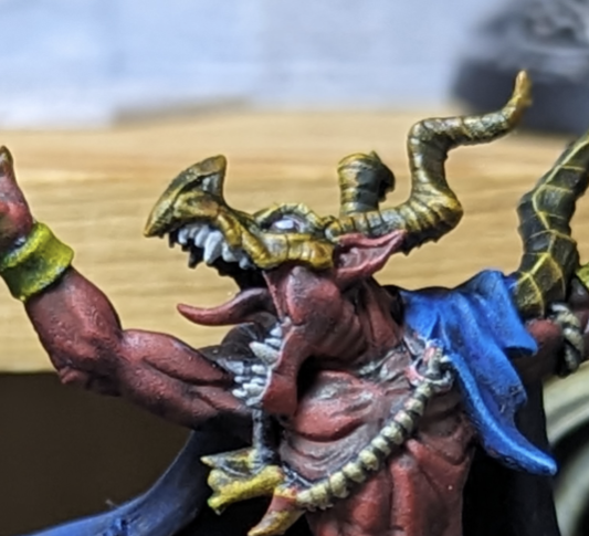
Well done. For me the upper bodies look spot on. But there’s something about the leg protectors that seems off for me, but I cant put my finger on it
I agree. The legs need more tuning for the reflections to look right. The torsos made more sense to me in how they should reflect.
What you have honestly looked pretty convincing from the thumbnail image so you are on the right track I’d say.
As for what looks a bit off, there are little to no really dark parts. I would try adding a dark brown to the opposite side to the brightest highlights
I agree. I envisioned the current brown as drying darker than it did so I’ll need to go back with a darker blend.


